Logo: Hydra Fitness
Creative Brief
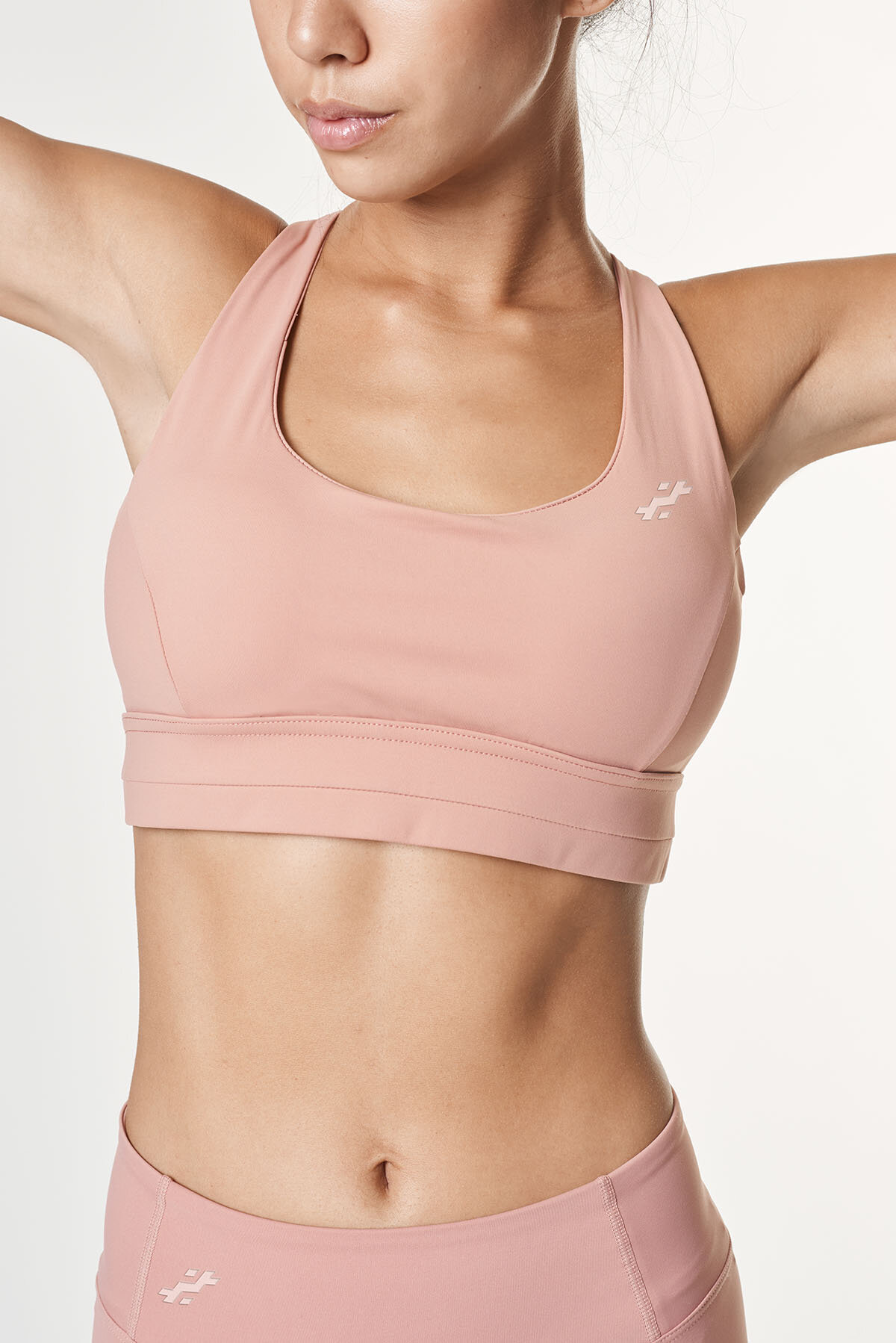
Hydra Fitness is a women’s fitness apparel clothing brand that was looking for a rebrand because it will be expanding into men’s apparel as well. Not only was the icon important because it needed to be legible and recognizable on clothing, but the font for the brand name needed to be unique as well. The client wanted something to show strength and power.
Design Strategy
The idea behind this logo was growth and transformation. The icon is constructed of the letter “H” with portions of it stacked into what could be seen as stairs - representative of growth in health and fitness. It could also be viewed as though it was a person being viewed from the side as they lift a barbell.
The font was chosen because it is versatile, easy to read, and unisex. The boxy, sans-serif look of it gives it a strong, heavy appearance. The original font was modified to be unique to this brand.